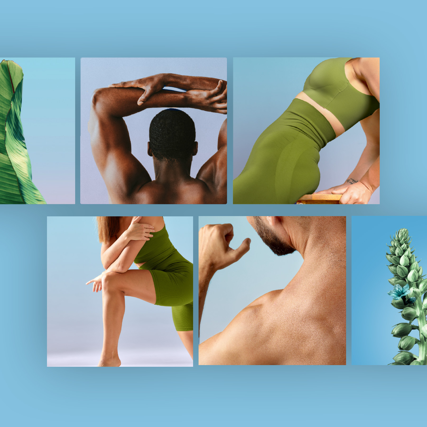
Wellspring Physiotherapy is all about finding the source of your pain and helping you get that spring back in your step. It was up to Soleil Studios to brand Wellspring in a light that was natural and authentic.
Visual branding
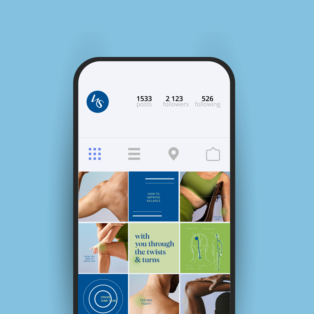
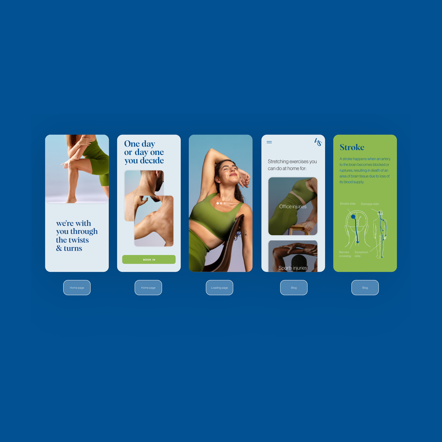
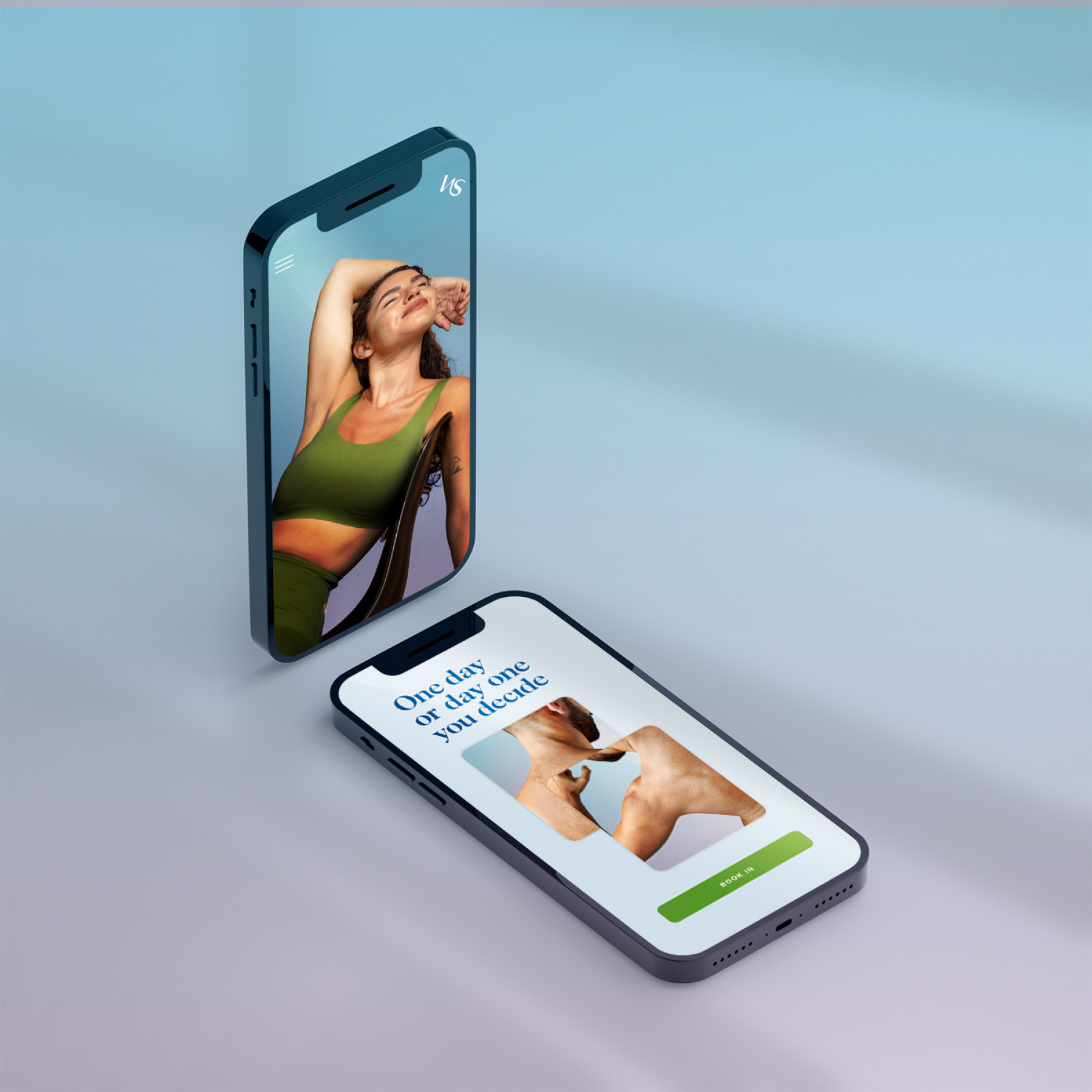
Beautiful blue and green tones were dominant in this branding, along with aspiration fitness imagery. This concept connected a natural yet sophisticated approach to the body and to nature. Physiotherapy being a physical form of restoring and maintaining health made it seem only fitting to connect with beautiful green tall plants that bend in the same way our spines do! It was important in the roll out the ensure we balanced the use of photography, textures and colours well to mantain a clean approach. The roll out consisted of clean typography, cool tones and close up photography.
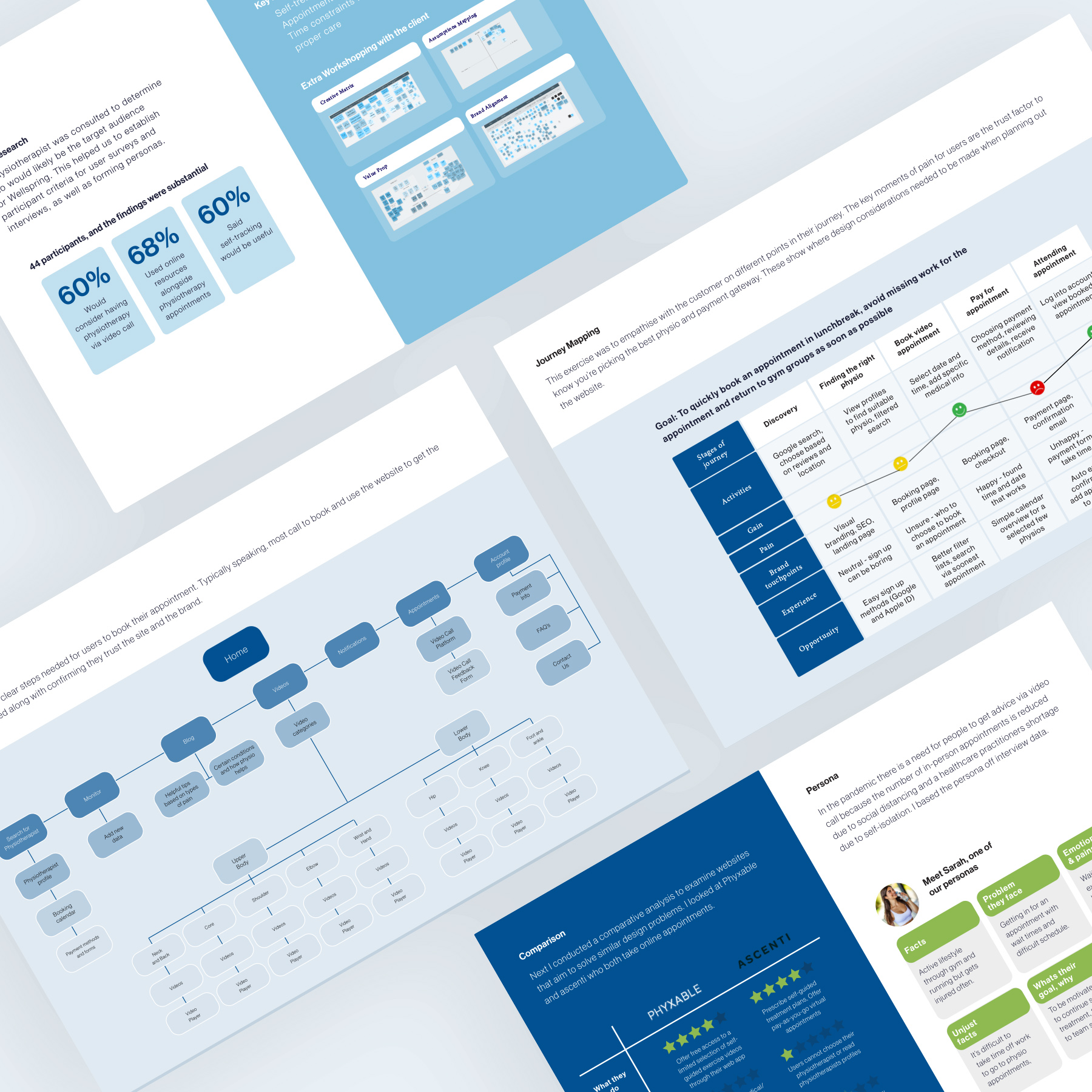
User research and web development
A physiotherapist was consulted to determine who would likely be the target audience for Wellspring. This helped us to establish participant criteria for user surveys and interviews, as well as forming personas. Research found that 60% would consider having physiotherapy via video call, 68% used online resources alongside physiotherapy appointments and 60% said self-tracking would be useful.
This means that:
1. Self-treatment is done regularly and at home often
2. Appointment waiting times are problematic
3. Time constraints makes it difficult to receive the proper care
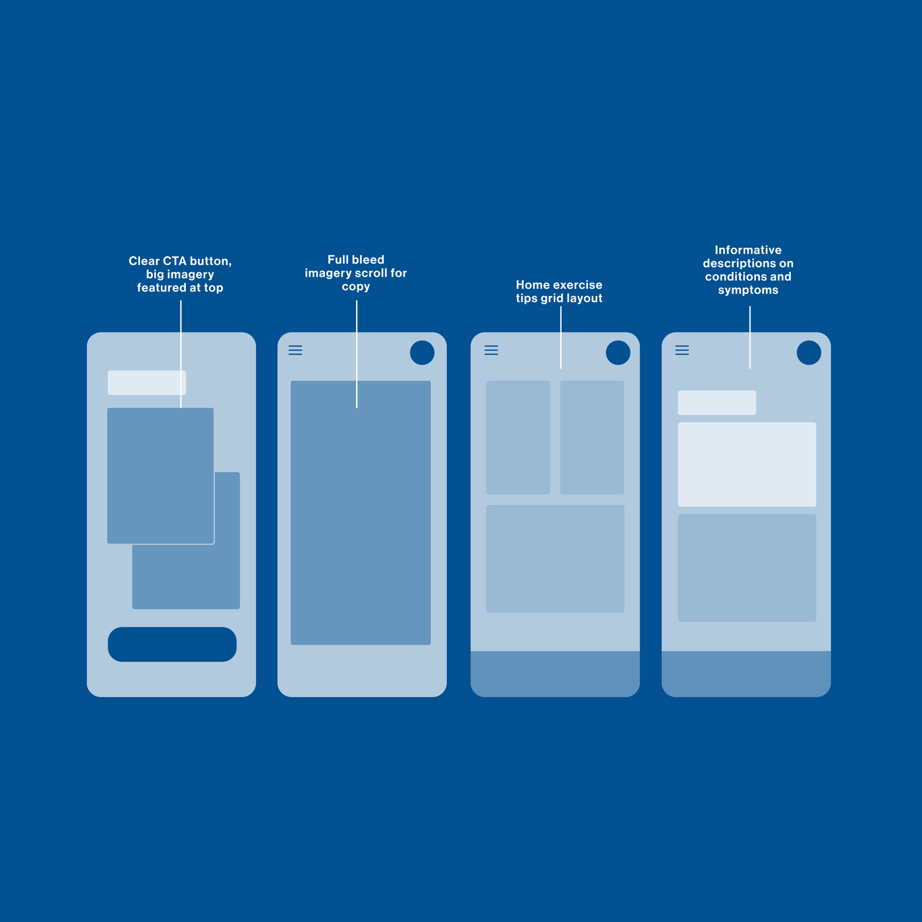
Comparison charts, personas, journey mapping, user mapping and sketching all formed the prototypes shown in the images below. An extension into online booking system, easy to track self-treatment were a development that improved the user journey substantially.
Feel free to contact me and ask me anything. I’m here to help - hello@soleil-studio.com.au.
Book a call© Soleil Design Studio 2022. All Rights Reserved.